What Makes A Design Great?
Business
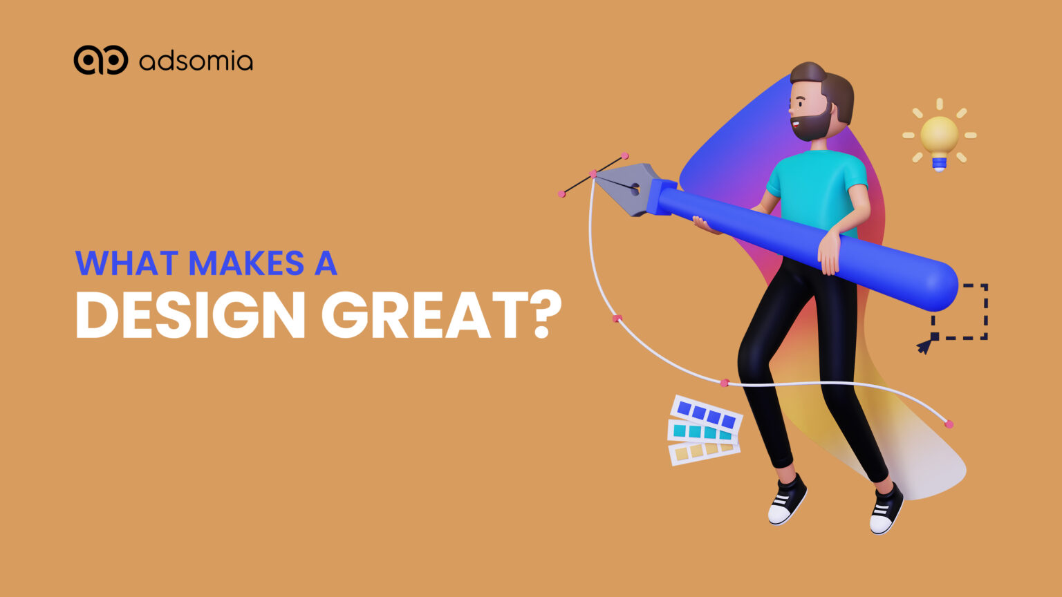
WHAT MAKES A DESIGN GREAT?
Graphic design is a profession, applied art, and academic discipline whose activity consists in projecting visual communications intended to transmit specific messages to social groups, with specific objectives. It is an interdisciplinary branch of design and of the fine arts. Graphic design is about much more than creating which is nice to look at. It’s a form of visual communication that provides information, shares ideas, and persuades the audience to consider new perspectives. And it is also a craft where professionals create visual content to communicate messages. By applying visual hierarchy and page layout techniques, designers use typography and pictures to meet users’ specific needs and focus on the logic of displaying elements in interactive designs, to optimize the user experience. But learning graphic design is not hard, but it does require creative thinking, an aptitude for art and design, time and dedication. Graphic design requires learning the necessary tools, as well as understanding and applying the principles and theories of design. There are a few principles of designing, if followed accordingly the design will be very attractive and meaningful. Every design is created with an intended message and audience in mind. By employing these five principles, you will be on your way to creating an effective and comprehensible design. The principles are as follows:
- Balance
- Proximity
- Alignment
- Repetition
- Contrast
- BALANCE
Elements of art carry weight as well. Although it is visual weight and not the actual weight, there is a similar seesaw effect when a design is not balanced. The overall appeal of composition relies on how the visual weight is distributed. Three categories of balance exist: radical, asymmetric, and symmetric. A design is considered symmetrical when the elements of the composition are equally balanced. This kind of balancing gives the piece a sense of order and formality, which is why it is commonly used in designs for religious art and institutional architecture. A design has radial balance when all of its elements are considered equal around one central point. Asymmetrical balance involves opposite weights, making the composition not visually equal but maintaining symmetry. When compared to symmetrical designs, asymmetrical designs are often more visually interesting because they give the impression of movement within a piece by leading the eye around the entire composition.
- PROXIMITY
A designer would mainly use proximity to deploy or create links for two reasons. We see design elements as being related when we see them next to one another in composition. A designer can convey that there is no relation between elements by placing them apart. Relevance, organization, structure, and hierarchy are all produced by the relationships between the elements. A designer must consider proximity when aiming to convey a message or achieve a particular outcome, particularly in the field of marketing and advertising. Using intimate proximity is seen by graphic designers as a creative branding strategy.
- ALIGNMENT
The placing of elements on a page is referred to as alignment. Beyond merely keeping things organized, its importance is in enhancing a design’s or page layout’s all-around visual appeal. When creating a product, designers take into consideration the way consumers naturally scan a page. The methods and situations when you employ left, right, centered, and justified alignment all differ. Left alignment is most common because it aligns with how text is generally read in English-speaking nations, which is from left to right. The other types are purposely used for some tasks, such as promotional, decorative, or in smaller bodies of text.
- REPETITION
When an element is used more than once across a design, repetition is produced. Although it might appear straightforward, designers rely on the idea of repetition to give compositions a sense of controlled movement and consistency. You’ll need to repeat aspects in every design, but doing so will help to improve and unify the design’s visual attractiveness.
- CONTRAST
Imagine a design where there is no contrast at all. Every colour, font, shape, etc. would be the same size, and the outcome would be a rather boring composition. A design “pops” when contrast is being used, and viewers are more likely to recall it as a result.
Related Posts
- siteadmin
- November 8, 2022
This is Why Digital Marketing is Important
Digital Marketing This is Why Digital Marketing is Important How does marketing affect our dail ..
- siteadmin
- January 3, 2023
The Importance of SEO for Business in 2023
Business The Importance of SEO for Business in 2023 Search Engine Optimization or SEO helps opt ..
- siteadmin
- November 9, 2022
This you should know about content marketing
Business This you should know about content marketing Content Marketing is a marketing strategy ..